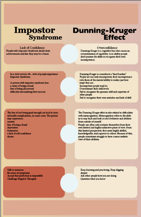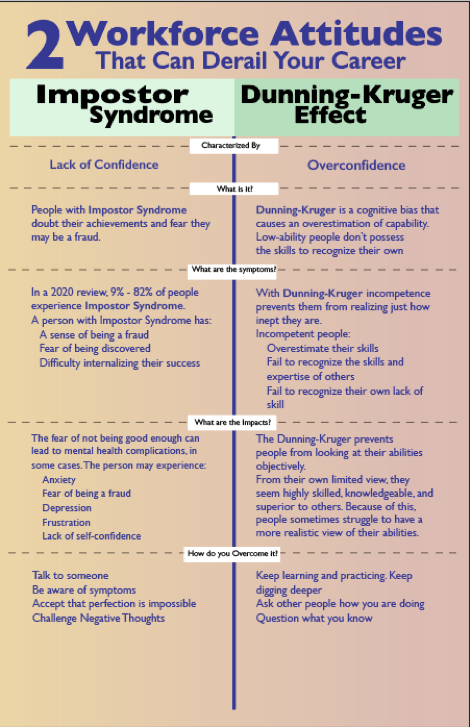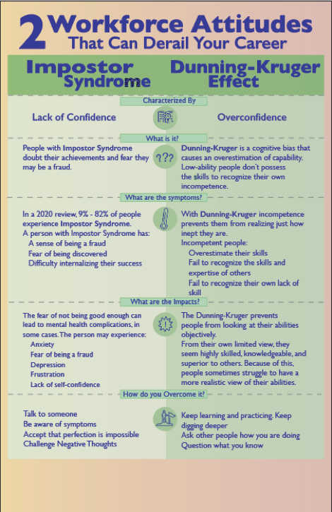
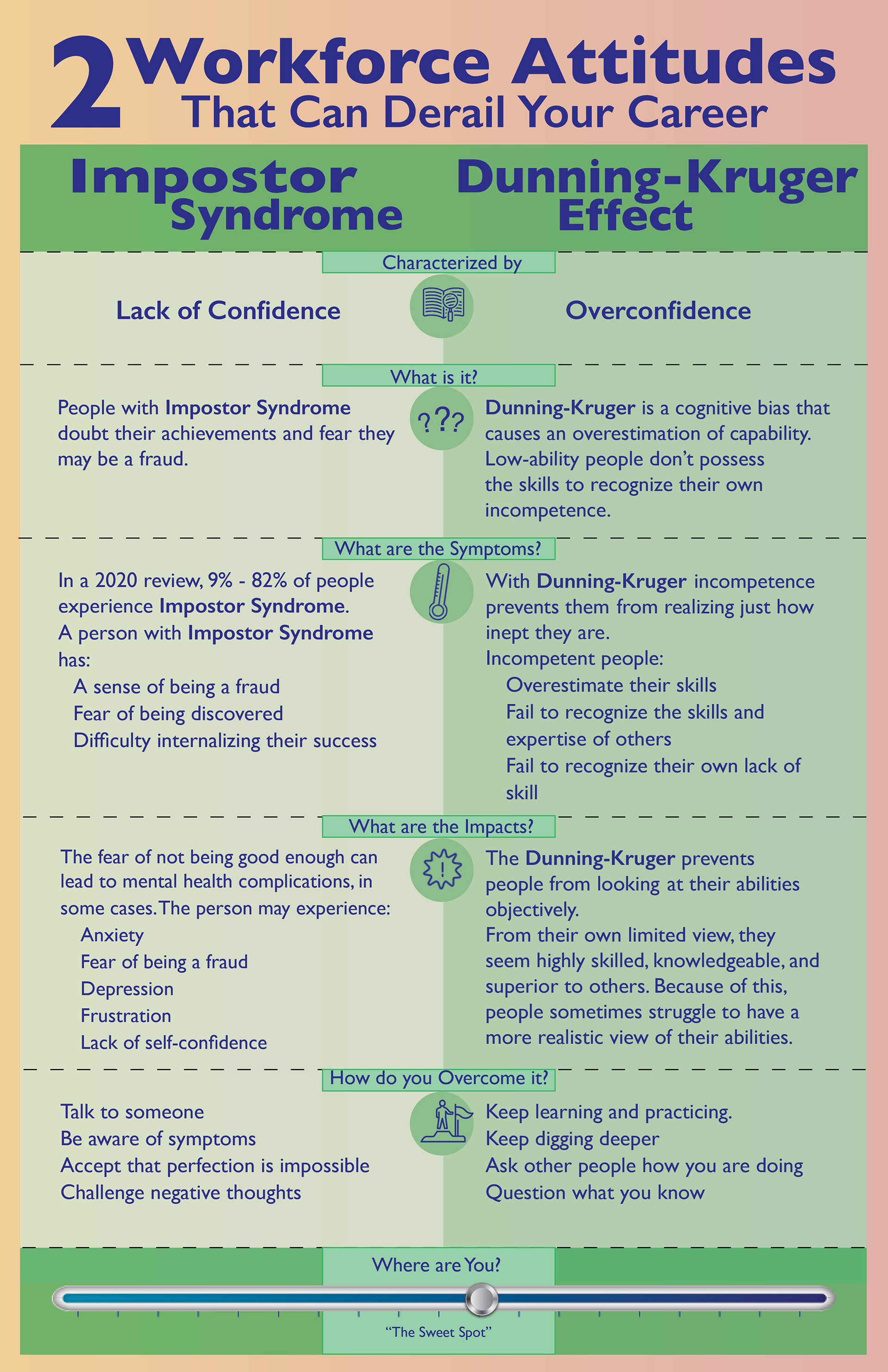
Problem: Study and understand Impostor Syndrome and the Dunning-Kruger Effect. Create a digital portfolio piece that displays the concepts and highlights the differences
But wait. This didn't start as an Infographic. My original idea was to use type design comparing the two concepts - one in a serif font, and the other sans. The idea wasn't working and I realized that comparing and contrasting two conditions is tailor made for an Infographic.
Browsing for examples helped me settle on using a portrait orientation with two vertical columns.


What did I learn?
From left to right below, I learned to keep trying different things until something clicks. I didn't think a color change would help and wasn't convinced I needed icons until I added them in. I was probably going through some Impostor Syndrome along the way, but I was finally able to accept the outcome. Hope you like it.